Why Do Some App Icons Look Blurry On iPhone?
Why Do Some App Icons Look Blurry On iPhone?
https://www.slashgear.com/2206763/why-do-some-iphone-app-icons-look-blurry/
Publish Date: 2026-07-06 14:45:00
Source Domain: www.slashgear.com
Whenever a new iOS update comes out, iPhone users tend to be extra vigilant about spotting cool new features. In the case of iOS 26.5, notable upgrades include RCS messaging with end-to-end encryption, automatic pairing for Magic accessories, and improved Suggested Places in Apple Maps. However, it’s not all sunshine and rainbows — the release of iOS 26 has been riddled with mishaps, including one where some app icons may appear blurry or out of focus to some users.
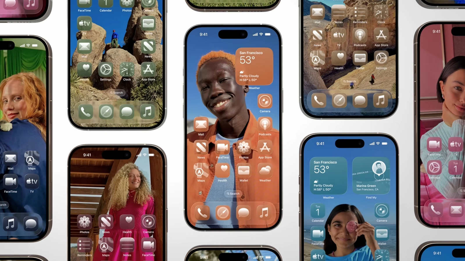
This likely has something to do with Liquid Glass, Apple’s new design feature that rolled out with iOS 26, which makes user interface elements like app icons appear, as the name implies, glassy and somewhat translucent. You also have an added option of choosing between two Liquid Glass looks for your app icons: “Clear” to make them appear see-through, or “Tinted” if you prefer a bit more opacity and contrast.
If you’ve recently updated your iPhone software to the latest version of iOS 26, your app icons should automatically adapt to the new look. However, some iPhone users online have noted that not all app icons have the glassy aesthetic. If you come across one that appears low-resolution, distorted, or just not like the others, it’s highly likely that it’s a third-party app that has not yet updated its icon to be Liquid Glass-compatible.
Some potential fixes to try
Jam Kotenko/SlashGear
…
Source